


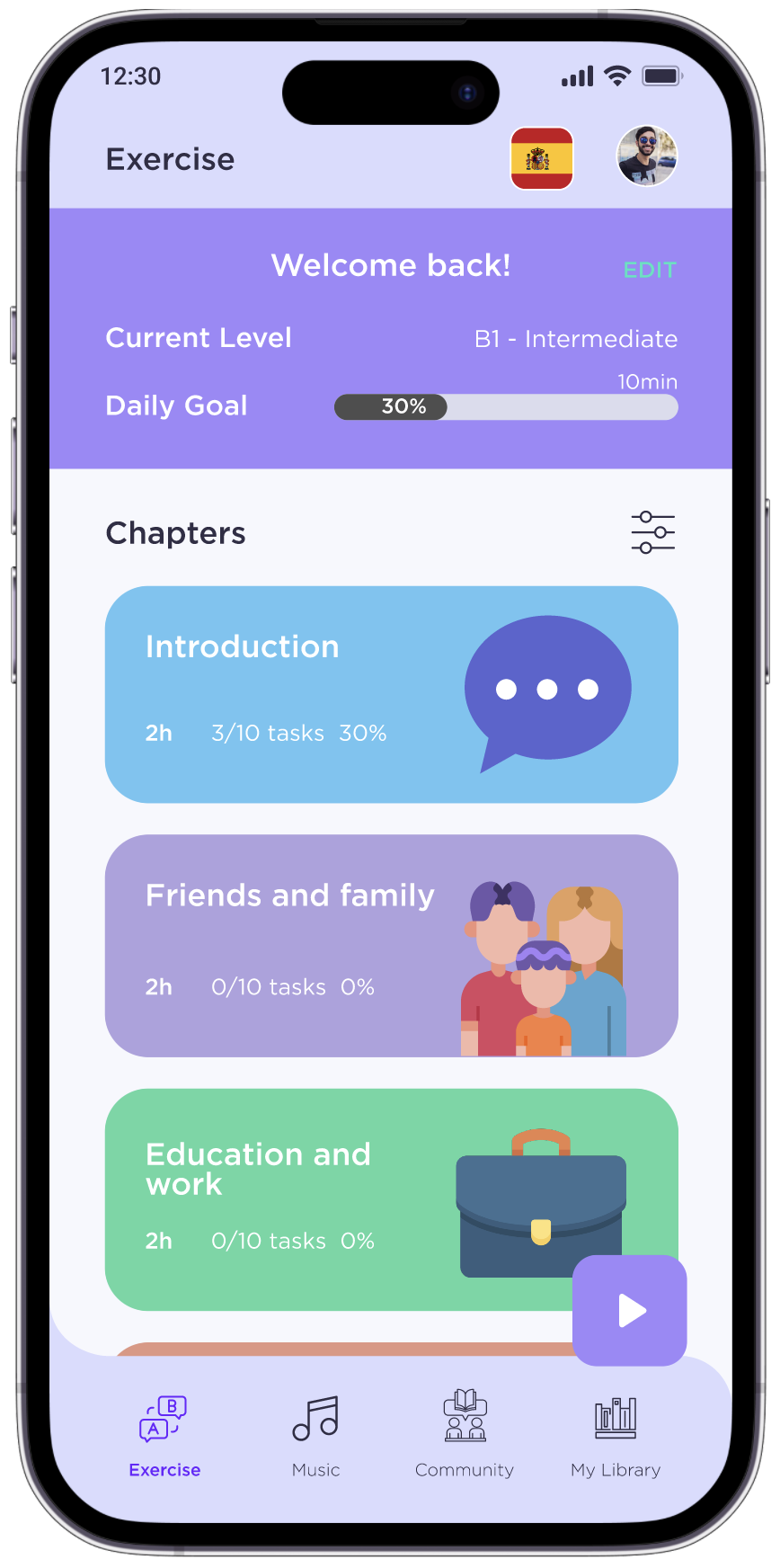
COLEARN IS A VOCABULARY LEARNING APP THAT ALLOWS USERS TO PRACTISE FOREIGN LANGUAGES FOR DIFFERENT OCCASSIONS, ADD WORDS TO USER’S LIBRARY AND ENRICHES THE LIBRARY BY WORDS SHARED BY OTHER USERS. IT OFFERS ALTERNATIVE PRACTISES SUCH AS LEARNING WITH MUSIC AND LOCAL SLANG EXCHANGE.

Project details
In today's interconnected world, the ability to expand our vocabulary and learn new languages has become increasingly crucial. As a UX designer, I undertook the exhilarating challenge of creating an innovative and immersive vocabulary learning app, that implements fun and interaction through social language exchange.
Process
Creating a vocabulary learning app requires a structured and systematic approach. The process I followed encompassed several key stages:
UNDERSTANDING: Defining the goals, objectives, and target audience for the app laid the foundation for the entire design process.
USER-CENTERED DESIGN: Adopting a user-centered design approach ensured that the app was tailored to meet the needs and expectations of the target audience, providing them with an intuitive and seamless learning experience.
ITERATIVE DESIGN AND TESTING: The iterative design process involved creating prototypes, testing them with users, and gathering feedback to refine the app's functionality and usability.

Analysing the competition
To gain a deeper understanding of the vocabulary learning app landscape, I conducted a thorough analysis of three popular vocabulary apps: Busuu, Xeropan, and Duolingo. This analysis aimed to identify their strengths, weaknesses, and opportunities for improvement. Key findings from the analysis included:

User Interviews and Surveys
To gather valuable insights into user preferences, pain points, and desired features, I conducted interviews with three individuals who fit the target audience profile. The interviews covered topics such as their motivation for learning new vocabulary, preferred learning methods, and the challenges they faced with existing apps. Additionally, I distributed surveys to a wider audience to gather quantitative data on user preferences and learning habits.

Key Insights
The interviews and surveys provided invaluable information, including:
- Users' preference for bite-sized learning content for quick, on-the-go learning.
- The need for interactive exercises and more engaging ways to practise to reinforce vocabulary retention.
- A desire for personalized learning paths based on individual interests and proficiency levels
- Users tend to have better results when combining fun with productivity and learning
- the need for more authentic material, that would be applicable on daily basis.

User Persona
Based on the insights gleaned from user interviews and surveys, I developed a user persona named "Leandro." Leandro embodies the characteristics, goals, motivations, and pain points of the target audience. He serves as a guiding archetype throughout the design process, ensuring a user-centric approach to decision-making.
Problem Statement
Leandro needs a way to flexibly learn and practice language skills and vocabulary because he studies and works among an international, multicultural crowd. Also, he needs a way to practice vocabulary, while still having fun in a community and being entertained because he enjoys socializing with people with common goals. We will know this to be true when we see Leandro can carry a relaxed banter in a foreign language with others, without the time spent learning as a distraction from his full-time studies, and when we see that his skills improve along with his non-decreasing motivation.
User Flow
GOAL:
Complete a language lesson
Architecture
At this point of the process I sketched out ideas for different features and how one would interact with them to achieve ones goal.

wireframes
First hand sketching, then using design tools like Sketch or Figma, I created wireframes to simulate the user experience.
Low-fidelity

mid-fidelity


implementing night mode
Having found out via interviews and surveys, that majority of studying is being done in the late hour, night-time, in fact very often in bed, I have decided to implement an option of switching between the light and dark mode from the start, to avoid potential pain points regarding the accessibility.

Prototype
Prototyping played a crucial role in visualising the app's structure, user interface, and interactions. Feedback from users was collected through usability testing, leading to iterative refinements of the app's design.
4
5
6
2
1
3


Usability Testing Report
Goal
I conducted this study to evaluate the app's navigation and how smoothly users can access its main features. My goal was to understand if users comprehend the app and can easily perform basic tasks when they first use it. Through observation and measurement, I've identified any issues or areas that require improvement.
Objectives
The aim was to evaluate the ease of navigating through the app's core features and identifying any pain points, frictions, or design flaws that may hinder the user experience.
Methodology
Combination of unmoderated in-person and unmoderated remote testing (via Discord).

Results and Recommendations
preference testing
I have conducted a preference testing via UsabilityHub regarding the UI design, which proved users’ preference of a more lively version of the app (to my surprise :D, personally I prefer the more toned-down version, which its less distracting.

70%

30%
LATEST ITERATION


INTERACTIVE PROTOTYPE

SUMMARY
Embracing User Participation for Effective Product Development
In this UX design case study, I had a short timeline that didn't allow me to dive too deep into every aspect of the process. But hey, that didn't stop me from making some awesome improvements! After the initial usability testing, I made a bunch of changes based on the feedback I received. The app definitely deserves another round of testing to make sure it's better now.
Despite the time constraints, I had to be smart about where I focused my efforts. I couldn't cover everything in detail, but I made the most of the resources I had. I do recognize that there are areas I could explore further in future iterations, though.
One big takeaway from this case study is the importance of involving users in product development. Seriously, listening to people and getting their honest feedback made a huge difference in making design decisions that were conscious and user-friendly. I learned that user participation is invaluable, and it helped me identify pain points and validate my assumptions.
The first round of usability testing was a game-changer. I learned so much and made a ton of improvements based on what I discovered. But here's the thing: design is an iterative process. So, I think it's a good idea to test the app again after all the changes I've made. That way, I can be sure that it's been refined and tailored to the users' needs.
To wrap it up, involving users throughout the design journey is key. Their feedback guides me in creating products that truly meet their expectations. So, let's keep listening, iterating, and creating awesome user experiences!